Selecting Our Sources
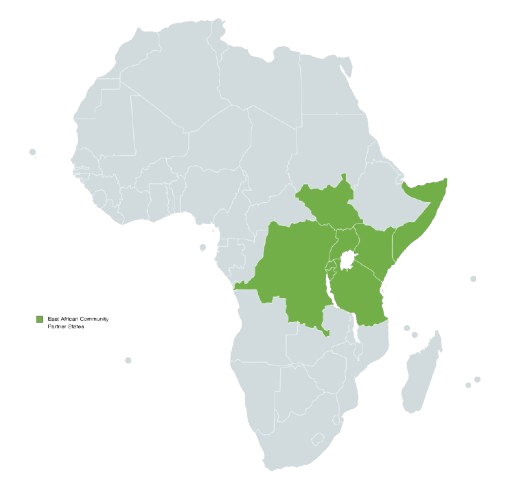
For this project, we focused on food security trends in Tanzania, Kenya, and Somalia to explore how economic and environmental factors influence food prices and availability. To build our dataset, we pulled from multiple sources that provided historical data, market trends, and climate-related insights.
One of our main sources was Humanitarian Data Exchange (HDX), which gave us country-specific food price indices and socio-economic indicators. We also used Crisis Group reports, like Fighting Climate Change in Somalia’s Conflict Zones, which helped us understand how conflict and environmental instability impact food security. Another key source was Brookings Institute research, especially their studies on locust swarms and other agricultural disruptions in East Africa. Along with these, we pulled data from humanitarian reports and online repositories tracking food prices, climate conditions, and inflation trends.
One of the biggest challenges we faced was inconsistent data reporting. Some datasets had missing values, so we had to cross-check multiple sources or decide whether to leave certain data points out. Another issue was unit standardization—different datasets used different currencies and measurement units, so we converted everything into USD per kilogram to make fair comparisons. Time intervals also varied across datasets, meaning we had to align them carefully for accurate time-series analysis. Despite these challenges, we built a dataset that let us track key food security trends and compare data across multiple East African countries.
Processing Our Data
Once we had our datasets, we had to clean, standardize, and analyze them. The first step was dealing with missing data. When possible, we used interpolation to estimate missing values, but if data gaps were too large, we omitted those sections to maintain accuracy. We also converted all food price data to USD per kilogram so we could compare prices across regions.
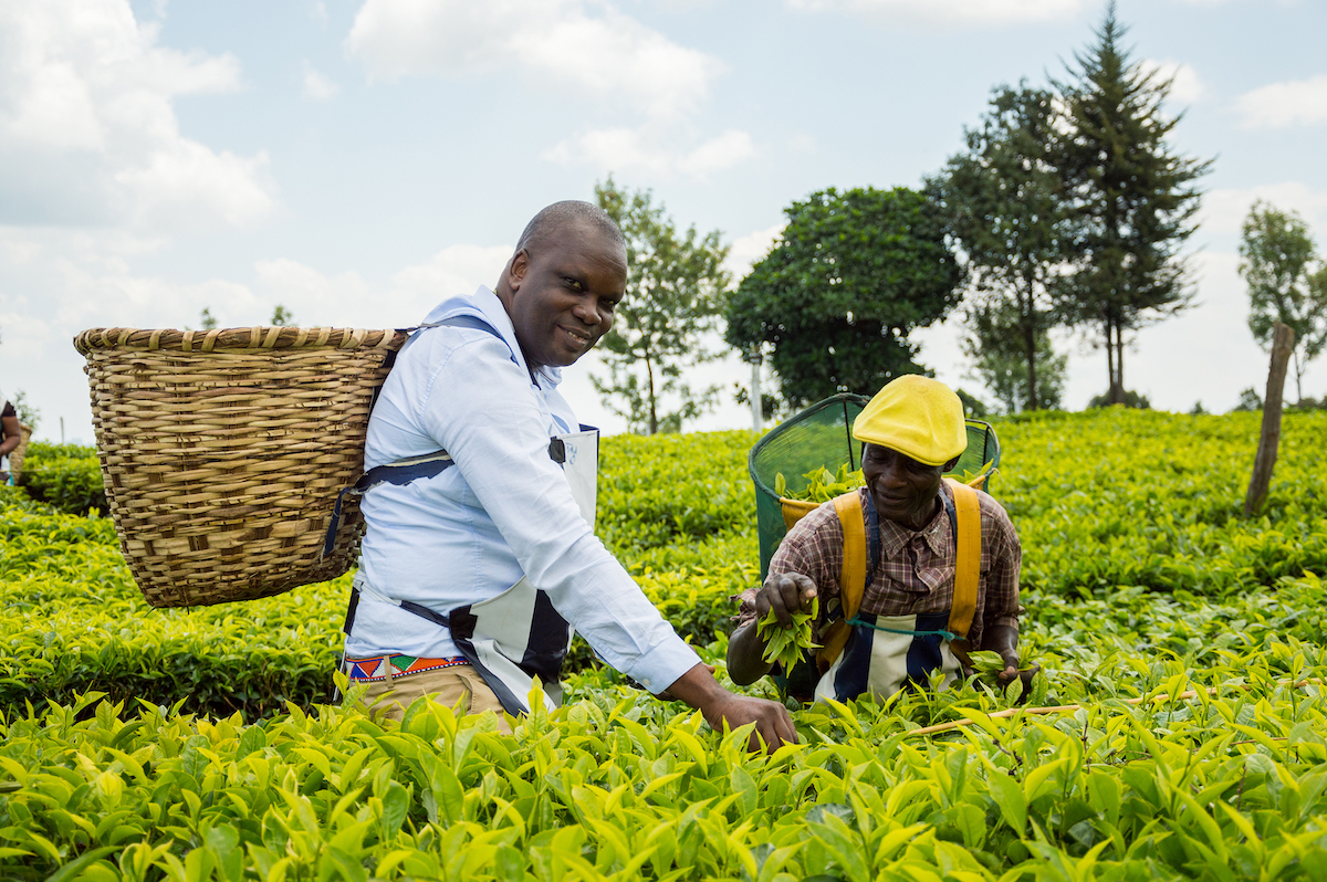
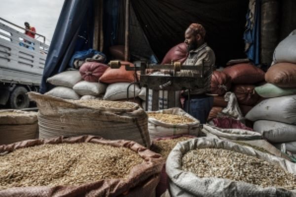
Since our goal was to analyze staple food consumption, we filtered out commodities that weren’t as relevant to food security in East Africa. We focused on maize, beans, rice, and sorghum because they showed up consistently across datasets and are essential staple foods in the region.
After cleaning the data, we ran different types of analysis. Time-series analysis helped us track food price trends over time and their relationship with factors like droughts, inflation, and conflict. Geospatial mapping allowed us to visualize the most common commodities in each country, highlighting regional agricultural differences. Another key analysis looked at average food costs across Tanzania, Kenya, and Somalia, with and without meat, to account for extreme outliers like Somalia’s high meat prices. This helped us better understand food affordability trends in the region.
We ran into a few challenges during this stage. Many datasets focused more on urban markets, meaning rural food insecurity was often underreported. In Somalia, ongoing conflict made data collection inconsistent, so we had to be cautious about making broad conclusions. National-level statistics also sometimes masked regional differences, limiting our ability to dive deeper into localized trends. Even with these limitations, our approach helped us structure a strong and insightful analysis of food security in East Africa.

Presenting Our Narrative
After processing the data, we worked on making it engaging and easy to understand. We built a WordPress website to showcase our findings, organizing everything into interactive maps, graphs, and written explanations. One of our key visualizations is a map of the most common commodities per country, giving a side-by-side comparison of agricultural production in each region. Another major visualization is our line graph tracking commodity price fluctuations from 2006 to 2025, which highlights major trends, including dramatic price spikes in Somalia.
We also created bar charts and pie charts to show food commodity counts and distributions across East Africa. One of the most useful visualizations is our bar graph on the most common commodities in East Africa, which highlights how dominant maize, beans, rice, and sorghum are while also showing the role of other staple foods like tomatoes, wheat, and potatoes. Another key visualization compares average food costs across East African countries, with and without meat, to account for extreme price differences like Somalia’s unusually high meat costs.
When designing our visualizations, we focused on clarity and consistency. We used a color-coding system, where red represents high food prices and food insecurity, green represents stability, and yellow represents moderate changes. Instead of displaying raw numbers, we used percentages to make cross-country comparisons clearer. We also added annotations on key data points to highlight major trends and give extra context.
Accessibility was also a priority. We made sure our website was mobile-friendly and worked well on different screen sizes. We added alt text to all images and visualizations to make the content readable for screen readers. We also chose a high-contrast color palette to improve readability and ensure the site is accessible to color-blind users. Our goal was to make the research available to as many people as possible, including policymakers, researchers, and anyone interested in food security issues.